The only rule in photography is that there are no rules. However, there are many composition guidelines which can be applied in almost any situation, to enhance the impact of a scene. Below are ten of the most popular and most widely respected composition 'rules'.
Rule of Thirds
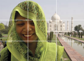
Imagine that your image is divided into nine equal segments by two vertical and two horizontal lines. Try to position the most important elements in your scene along these lines, or at the points where they intersect. Doing so will add balance and interest to your photo. Some cameras even offer an option to superimpose a rule of thirds grid over the LCD screen, making it even easier to use.
 Notice how the building and horizon are aligned along rule-of-thirds lines. Image by Trey Ratcliff.
Balancing Elements
Placing your main subject off-centre, as with the rule of thirds, creates a more interesting photo, but it can leave a void in the scene which can make it feel empty. You should balance the 'weight' of your subject by including another object of lesser importance to fill the space.
 Here, the visual 'weight' of the road sign is balanced by the building on the other side of the shot. Image by Shannon Kokoska.
Leading Lines
When we look at a photo our eye is naturally drawn along lines. By thinking about how you place lines in your composition, you can affect the way we view the image, pulling us into the picture, towards the subject, or on a journey 'through' the scene. There are many different types of line - straight, diagonal, curvy, zigzag, radial etc - and each can be used to enhance our photo's composition.
 The road in this photo draws your eye through the scene. Image by Pierre Metivier.
Symmetry and Patterns
We are surrounded by symmetry and patterns, both natural and man-made., They can make for very eye-catching compositions, particularly in situations where they are not expected. Another great way to use them is to break the symmetry or pattern in some way, introducing tension and a focal point to the scene.
 The symmetry of this chapel is broken by the bucket in the bottom right corner. Image by Fabio Montalto.
Viewpoint
Before photographing your subject, take time to think about where you will shoot it from. Our viewpoint has a massive impact on the composition of our photo, and as a result it can greatly affect the message that the shot conveys. Rather than just shooting from eye level, consider photographing from high above, down at ground level, from the side, from the back, from a long way away, from very close up, and so on.
 The unusual viewpoint chosen here creates an intriguing and slightly abstract photo. Image by ronsho.
Background
How many times have you taken what you thought would be a great shot, only to find that the final image lacks impact because the subject blends into a busy background? The human eye is excellent at distinguishing between different elements in a scene, whereas a camera has a tendency to flatten the foreground and background, and this can often ruin an otherwise great photo. Thankfully this problem is usually easy to overcome at the time of shooting - look around for a plain and unobtrusive background and compose your shot so that it doesn't distract or detract from the subject.
 The plain background in this composition ensures nothing distracts from the subject. Image by Philipp Naderer.
Depth
Because photography is a two-dimensional medium, we have to choose our composition carefully to conveys the sense of depth that was present in the actual scene. You can create depth in a photo by including objects in the foreground, middle ground and background. Another useful composition technique is overlapping, where you deliberately partially obscure one object with another. The human eye naturally recognises these layers and mentally separates them out, creating an image with more depth.
 Emphasise your scene's depth by including interesting subjects at varying distances from the camera. Image by Jule Berlin.
Framing
The world is full of objects which make perfect natural frames, such as trees, archways and holes. By placing these around the edge of the composition you help to isolate the main subject from the outside world. The result is a more focussed image which draws your eye naturally to the main point of interest.
 Here, the surrounding hills form a natural frame, and the piece of wood provides a focal point. Image by Sally Crossthwaite.
Cropping
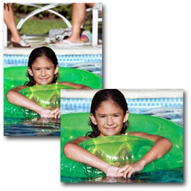
Often a photo will lack impact because the main subject is so small it becomes lost among the clutter of its surroundings. By cropping tight around the subject you eliminate the background 'noise', ensuring the subject gets the viewer's undivided attention.
 Cut out all unnecessary details to keep keep the viewer's attention focused on the subject. Image by Hien Nguyen.
Experimentation
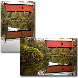
With the dawn of the digital age in photography we no longer have to worry about film processing costs or running out of shots. As a result, experimenting with our photos' composition has become a real possibility; we can fire off tons of shots and delete the unwanted ones later at absolutely no extra cost. Take advantage of this fact and experiment with your composition - you never know whether an idea will work until you try it.
 Digital photography allows us to experiment with different compositions until we find the perfect one. Image by Jule Berlin.
Composition in photography is far from a science, and as a result all of the 'rules' above should be taken with a pinch of salt. If they don't work in your scene, ignore them; if you find a great composition that contradicts them, then go ahead and shoot it anyway. But they can often prove to be spot on, and are worth at least considering whenever you are out and about with your camera.


