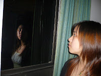
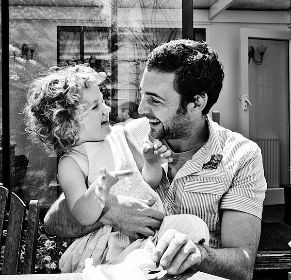
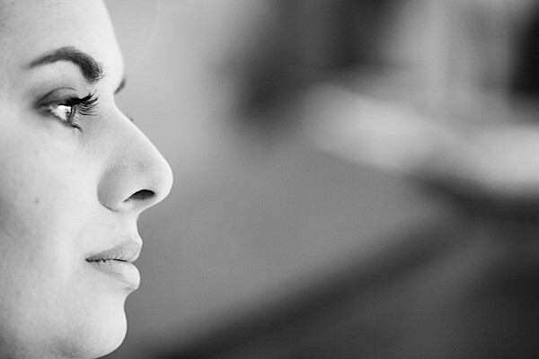
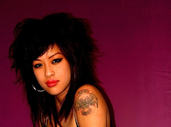
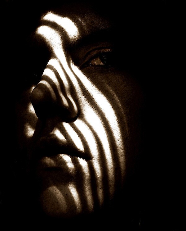
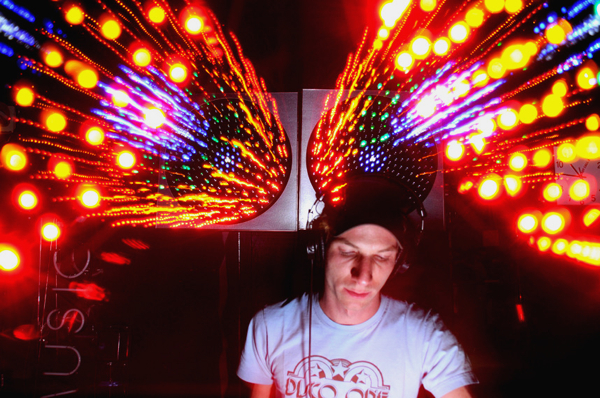
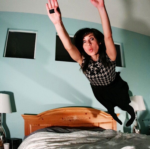
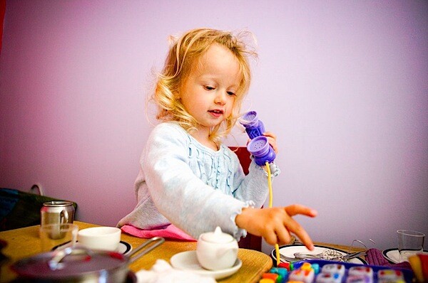
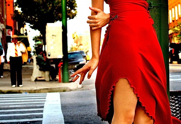
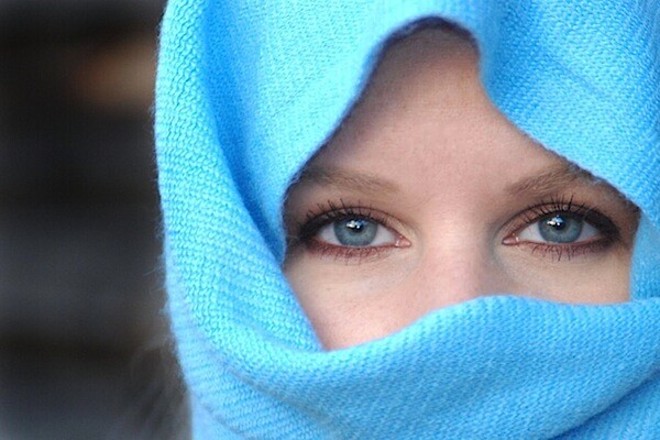
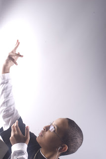
- A Vignette Photo
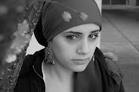
- A Grayscale Method Photo
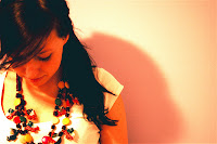
- A One Item Kept in Color Photo
- A selective Focus Photo
- A high pass filtered portrait or minimal saturation/high contrast portrait to emphasize mood.
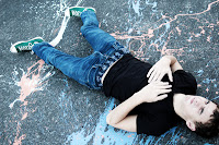
- One WHACKY anything goes portrait (change the colors, use the liquefy tool, use a PS filter, and make this as unique and interesting as you can - but make sure it is interesting and not just insane).
This site is a tool for students in Digital Photo at Shorecrest. It is used to give you useful information about our class, assignments, and due dates.
Tuesday, November 30, 2010
Portrait Editing
Monday, November 22, 2010
Thanksgiving Break Assignment
Make your own light box for $.50
Not having enough light seems to be the #1 annoyance to most people when they’re trying to take nice photos of their items. And #2 is what to do with that light if you do have it!
We can’t post photos here, so I’ll have to keep linking to flickr, but here goes…
I guess lightboxes are cool. I dunno, I’ve never used one. I’ve sold lots of stuff on ebay and craigslist, and have a few things still listed in my vintage shop, and piece of cardboard and light bulb have always served me just fine.
Here’s what I call my 50 cent lightbox:
Yup, a sheet of Bristol board taped to the floor and wall. And today was a perfect day to demonstrate; cold, cloudy, blustery, and quite dark. What you see there is what you get. Not very good light. Big deal.
Enter the light bulb, or to be precise, the Ott bulb. These are cheap, easily available at hardware stores, and the best lighting invention since sliced bread. Even better in fact, since sliced bread has very little to do with photography.
Take one table lamp, remove shade, screw in Ott bulb, and put on stairs. What a difference!
Notice how the light is positioned roughly 45 degrees above the item, and about 45 degrees off to the side. If my space were bigger, I’d use a 2nd bulb on the left as well, to eliminate the shadows cast by this one. Oh well, I’ll just have to make it work. You can move the light around so that you don’t cast shadows where you don’t want them.
Now, stop here and take a good look. Those walls should be lighter. What’s going on? The camera wants to make everything a neutral tone, so if there’s a lot of light stuff in the photo, like here, it will try to darken it to get it to neutral. If I had taken a shot of only the white wall, it would have been even darker, but the floor is pulling the exposure up a bit.
This camera has “Exposure Compensation” which is used to essentially fool the meter. If I set it to overexpose by 1 f-stop, here’s what I get:
Much better. Some of the upper wall on the right is starting to get blasted now, but I don’t care.
So what’s that thing on the cardboard? It’s an ugly old, busted ceramic brooch. Can we make ugly look half decent?
Here’s a shot at floor level:
Not half bad lighting. Notice how only the front part is in focus. This is because the aperture is set to its widest (lowest number f-stop), so the depth of field (portion of the photo in focus) is very shallow. If I set the f-stop to the maximum (smallest aperture), it pulls much more into focus:
Maybe a bit too much detail for this ugly, dirty, broken thing. Buyer beware!
How about something much prettier? Here’s an AUTO shot of our next beauty contestant:
I’ve moved the light closer to the front because I like the illuminating better. Once again, everything is a bit too dark, but we know how to fix that. Here’s a closer shot:
Even darker! Why? Because there’s much more white in the picture, so once again, the camera is trying to pull that white towards neutral grey. So, we crank up the exposure compensation again, just like before, and we zoom in a bit:
The shallow depth of field is much more evident on this larger subject. The little diamond on the front ring of the lens is in sharp focus, but the rest fades into a blur. So once again, we set the aperture for a much higher number:
Now that’s a camera!
And two more examples using a macro:
All this with a sheet of cardboard and one light bulb on a miserable, dark day.
You don’t have to live in sunny California to take well lit photos, you just have to live close enough to a hardware store. And yes, all the item photos were taken on a tripod or with the camera on the floor. There’s absolutely no other way.
Thursday, November 18, 2010
Due end of next week
- 12 studio pics on a CS
- 30 portraits from outside of class
- 6 edited portraits from outside of class
- 1 portrait tutorial
Tuesday, November 16, 2010
portrait specifics
1. Find one or two interesting human subjects. The people you choose should WANT to be in the picture and they should be willing to cooperate.
2. Talk to your subject. You are the director of this adventure, make it what you want. Use colors or lighting to create a concept for your portrait. Costumes or uniforms work great. Imaginary ideas are good. Choose an interesting setting based on your concept.
3. Change angles between shots. Shoot at least 25 pictures of EACH of your two subjects. This will give a good variety of images to pick your 30 from.
5. Change your lighting; Use filters, flashlights, lamps, or multiple lights to enhance your picture.
6. Remember you are the boss, make them change their expression. Pretend it is high fashion and they have to create the next great "look" like blue steel (Zoolander).
7. Most importantly for this assignment don't forget your composition rules. Use framing, leading lines, rule of thirds, color contrast etc. to enhance your photo. And Always Fill the frame!!!!
HAVE FUN & BE CREATIVE!!!! try to think out of the norm to come up with a creative setting, pose, expression, outfit, etc to make an amazing portrait!!!!
Portraits
Once you have your 30 pics we will be editing them in fairly specific ways:
You will need to edit 6 portraits (not from in class) using the following techniques:
- A Vignette Photo
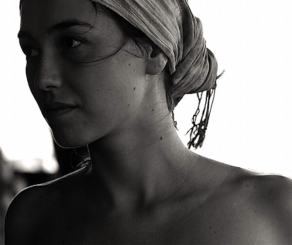
- A Grayscale Method Photo
- A One Item Kept in Color Photo
- A selective Focus Photo
- A minimally adjusted photo
- One WHACKY anything goes portrait (change the colors, use the liquefy tool, use a PS filter, and make this as unique and interesting as you can)
The Healing Brush:
http://livedocs.adobe.com/en_US/Photoshop/10.0/help.html?content=WSfd1234e1c4b69f30ea53e41001031ab64-7605.html
Red Eye"
http://www.creativepro.com/article/photoshop-how-to-five-ways-to-reduce-red-eye
For your anything goes image:
http://www.photoshoproadmap.com/Photoshop-blog/2009/03/31/35-creative-portrait-effects-photoshop-tutorials/
Color and B&W
http://digital-photography-school.com/mono-with-a-dash-of-colour-photoshop-cs2-tutorial
Thursday, November 11, 2010
Studio Lighting
Tuesday, November 9, 2010
10 tips
I want to look at some ways to break out of the mold and take striking portraits by breaking (or at least bending) the rules and adding a little randomness into your portrait photography. I’ll share ten of these tips today and a further ten tomorrow (update: you can see the 2nd part here).
1. Alter Your Perspective
Most portraits are taken with the camera at (or around) the eye level of the subject. While this is good common sense – completely changing the angle that you shoot from can give your portrait a real WOW factor.
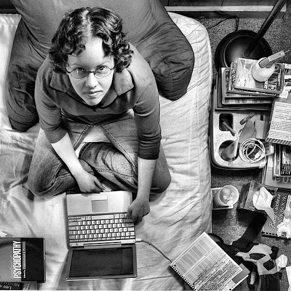
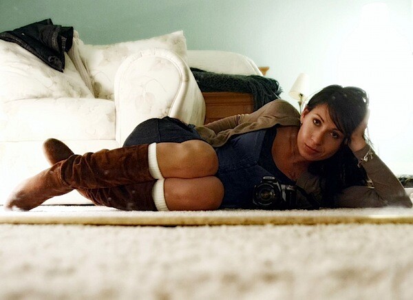
Get up high and shoot down on your subject or get as close to the ground as you can and shoot up. Either way you’ll be seeing your subject from an angle that is bound to create interest.
2. Play with Eye Contact
It is amazing how much the direction of your subject’s eyes can impact an image. Most portraits have the subject looking down the lens – something that can create a real sense of connection between a subject and those viewing the image. But there are a couple of other things to try:
A. Looking off camera – have your subject focus their attention on something unseen and outside the field of view of your camera. This can create a feeling of candidness and also create a little intrigue and interest as the viewer of the shot wonders what they are looking at. This intrigue is particularly drawn about when the subject is showing some kind of emotion (ie ‘what’s making them laugh?’ or ‘what is making them look surprised?’). Just be aware that when you have a subject looking out of frame that you can also draw the eye of the viewer of the shot to the edge of the image also – taking them away from the point of interest in your shot – the subject.
B. Looking within the frame – alternatively you could have your subject looking at something (or someone) within the frame. A child looking at a ball, a woman looking at her new baby, a man looking hungrily at a big plate of pasta…. When you give your subject something to look at that is inside the frame you create a second point of interest and a relationship between it and your primary subject. It also helps create ’story’ within the image.
3. Break the Rules of Composition
There are a lot of ‘rules’ out there when it comes to composition and I’ve always had a love hate relationship with them. My theory is that while they are useful to know and employ that they are also useful to know so you can purposely break them – as this can lead to eye catching results.
The Rule of Thirds is one that can be effective to break – placing your subject either dead centre can sometimes create a powerful image – or even creative placement with your subject right on the edge of a shot can sometimes create interesting images.
Another ‘rule’ that we often talk about in portrait photography is to give your subject room to look into. This can work really well – but again, sometimes rules are made to be broken.
4. Experiment with Lighting
Another element of randomness that you can introduce to your portraits is the way that you light them. There are almost unlimited possibilities when it comes to using light in portraits.
Side-lighting can create mood, backlighting and silhouetting your subject to hide their features can be powerful.
Using techniques like slow synch flash can create an impressive wow factor.
5. Move Your Subject Out of their Comfort Zone
I was chatting with a photographer recently who told me about a corporate portrait shoot that he had done with a business man at his home. They’d taken a lot of head and shoulder shots, shots at his desk, shots in front of framed degrees and other ‘corporate’ type images. They had all turned out fairly standard – but there was nothing that really stood out from the crowd.
The photographer and the subject agreed that there were plenty of useable shots but they wanted to create something ’special’ and out of the box. The photographer suggested they try some ‘jumping’ shots. The subject was a little hesitant at first but stepped out into the uncomfortable zone and dressed in his suit and tie started jumping!
The shots were amazing, surprising and quite funny. The shoot culminated with the subject jumping in his pool for one last image!
While this might all sound a little ’silly’ the shots ended up being featured in a magazine spread about the subject. It was the series of out of the box images that convinced the magazine he was someone that they’d want to feature.
6. Shoot Candidly
Sometimes posed shots can look somewhat…. posed. Some people don’t look good in a posed environment and so switching to a candid type approach can work.
Photograph your subject at work, with family or doing something that they love. This will put them more at ease and you can end up getting some special shots with them reacting naturally to the situation that they are in. You might even want to grab a longer zoom lens to take you out of their immediate zone and get really paparazzi with them.
I find that this can particularly work when photographing children.
7. Introduce a Prop
Add a prop of some kind into your shots and you create another point of interest that can enhance your shot.
Yes you might run the risk of taking too much focus away from your main subject but you could also really add a sense of story and place to the image that takes it in a new direction and gives the person you’re photographing an extra layer of depth that they wouldn’t have had without the prop.
8. Focus Upon One Body Part – Get Close Up
Get a lens with a long focal length attached to your camera – or get right in close so that you can just photograph a part of your subject. Photographing a person’s hands, eyes, mouth or even just their lower body… can leave a lot to the imagination of the viewer of an image.
Sometimes it’s what is left out of an image that says more than what is included.
9. Obscure Part of your Subject
A variation on the idea of zooming in on one part of the body is to obscure parts of your portrait subject’s face or body. You can do this with clothing, objects, their hands or just by framing part of them out of the image.
Doing this means that you leave a little to the imagination of the image’s viewer but also focus their attention on parts of your subject that you want them to be focused upon.
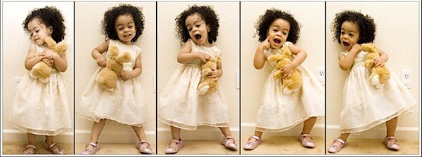
10. Take a Series of Shots
Switch your camera into ‘burst’ or ‘continuous shooting’ mode and fire off more than one shot at a time.
In doing this you create a series of images that could be presented together instead of just one static image.
This technique can work very well when you’re photographing children – or really any active subject that is changing their position or pose in quick succession.
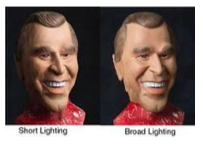
Short Lighting
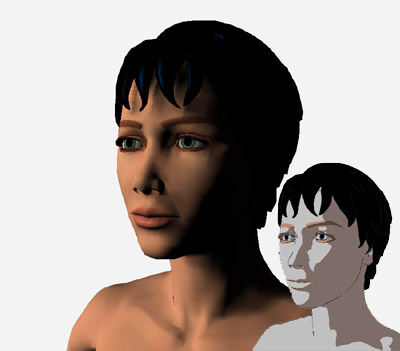
Short lighting illuminates the part of the face that is not facing directly at the camera. In Figure Z, we can see that the side of the face facing the camera is in the shadow side. Short lighting often is the preferred light positioning for most portraits especially for rounder faces or faces less defined facial features.
Putting the shadow side of the face closer to the camera narrows down the face and works well for majority of subjects except those with long or thin faces.
Broad Lighting
Broad lighting is the opposite of short lighting where the lit portion of the face faces the front of the camera. Showing the lit portion of the face directly at the camera broadens the face as it illuminates majority of the subject’s face instead of hiding it in the shadows.
While not as popular as short lighting, broad lighting can be used effectively with thinner faces and can make subjects such as the elderly look more radiant and lively. Broad lighting is a “cheerful” light position that portrays openness and excitement.
Read more: http://www.howitookit.com/classic-lighting-styles.html#ixzz14njY6ZBR
more on lighting
Broad Lighting
Here I want to say not a particular light pattern, but somewhat a combination of light patterns with subject's and main light's orientation to the camera. As you noticed, all light patterns were shown for a full face view. When you turn the subject's face to 3/4 view you have two choices to place the main light, which will create different effects. Broad lighting will create an effect of a broad face, because the wider [visible] part of the face, neck and shoulders will be lit and as such more prominent in the photograph. This approach is flattering mostly for slim and thin people, don't use it with heavy people, it will produce the opposite effect.
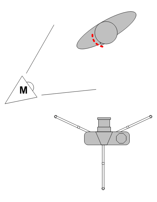
To achieve this effect you have to place the main light to the opposite side from the direction of the subject's face. So if the subject looks to your left (to the camera's left) - as shown below - you place the main light to your (camera's) right or very close to the camera.
Short Lighting
This approach is opposite to the broad lighting and achieves opposite results, it reduces the visible part of the subject's face, neck and shoulders that are lit by the main light. As the result, the heavy people with such approach seem thinner, which creates a flattering effect.
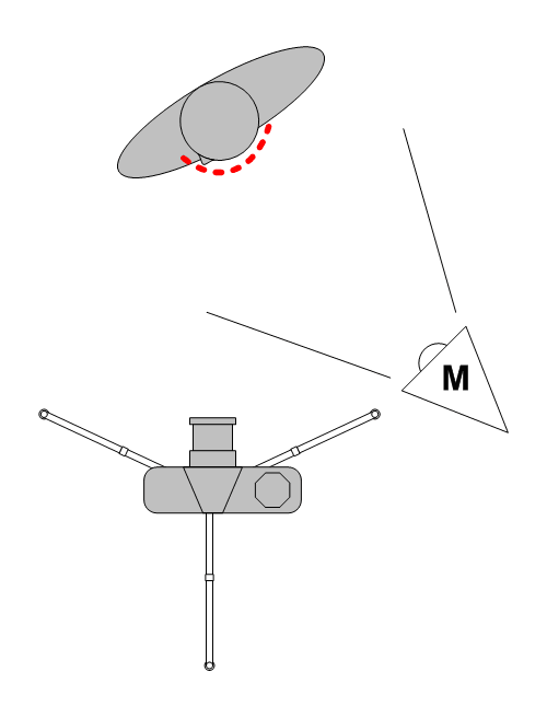
The diagram below shows the main light placement in relation to the camera and the subject. In contrary to the broad lighting the main light is placed in front of the subject's face (butterfly light pattern is often used with this approach.
Short and Broad lighting
Short light is type of studio lighting setup, where the face side which is further from the camera gets the main light. see the diagram for details. In this type of lighting setup, the side of the face which is toward the camera gets less light then the side facing away form the camera. The effect you get when using this lighting setup is a thin face, this is why it is good to photograph fat (or chubby) people with a short light setup.
Diagram 1 - Short Light
Let's look at a picture of a friend of mine - Winnie the poo. Looks like Winnie had allot of honey and he is quite chubby. The flash is set up to my right, and Winnie is looking to his left. This make his face look a bit thinner than what they really are. Short light is very useful in portrait photography, as it gives drama to the subject. (Short light setup also stresses skin wrinkles, to create even more drama for older people)
What Is Broad Light?
Broad light is just the opposite of Short light. In the Broad Light setup, THe side that is getting the most light is the side turning towards the camera. This setup is less commonly used for portraits as it tends to make people look chubby. See the diagram for setup.
Diagram 2 - Broad Light
Lets look at Winnie again. This picture was taken at the same focal length (135mm with 1.5 crop factor D70's sensor). This time Winnie looks very chubby. Oh Winnie! what have you been eating? Also note how the picture looks a bit flatter. There are not allot of light and shade plays.
For both types of light you can use a fill light at the opposite side to the main light, or do as I did and use a reflector at 45 deg. (see diagrams).
Conclusion:
Light Type | Side to Get Most Light | Chubbiness | Wrinkles |
Short Light | Away From Camera | Reduce | Intensify |
Broad Light | Facing Camera | Increase | Reduce |
Studio Lighting Portraits...
Studio Lighting!!!
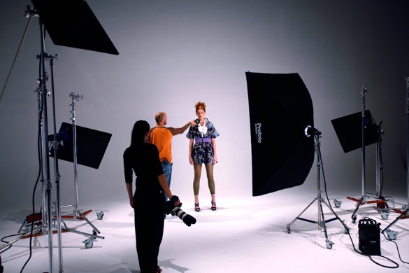
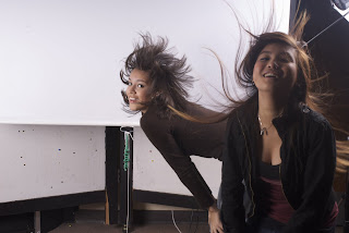
Your task this week is to shoot some interesting , creative and unique portraits using the studio lights. Remember the different lighting techniques demonstrated in class. Use the lights to add emotion, feeling, or interesting shadows to your images. Try to think out of the box, manipulate the image with Manual settings on the camera, blur motion, stop action, take tons of pics, and have FUN! Shoot for 1/2 the period in groups of 3 to 6 per light station. Everyone should shoot their own photo session. Take turns as each others subjects. Shoot a minimum of 12 pictures per photographer. We will then edit them and make one fantastic
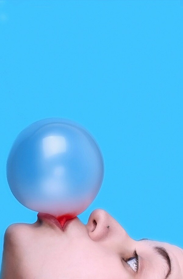
using your photoshop skills on Monday the 12th.